
McLaren's 2026 Brand Refresh: A New Identity Built From Its Past
McLaren Rebrand 2026: New Logo & Brand Identity
Summary
On September 22, 2026, McLaren unveiled a unified identity across Racing and Automotive, built around a new wordmark inspired by 1920s signage from Bruce McLaren's family service station in Remuera, Auckland. Papaya, the Speedmark and the Speedy Kiwi remain, reorganised within an expanded system. The refresh coincides with McLaren's £500 million UK investment, a 2030 performance SUV and its 2027 WEC Hypercar programme, though some F1 fans argue the new typography trades away the brand's sense of speed.
McLaren's 2026 Brand Refresh: A New Identity Built From Its Past
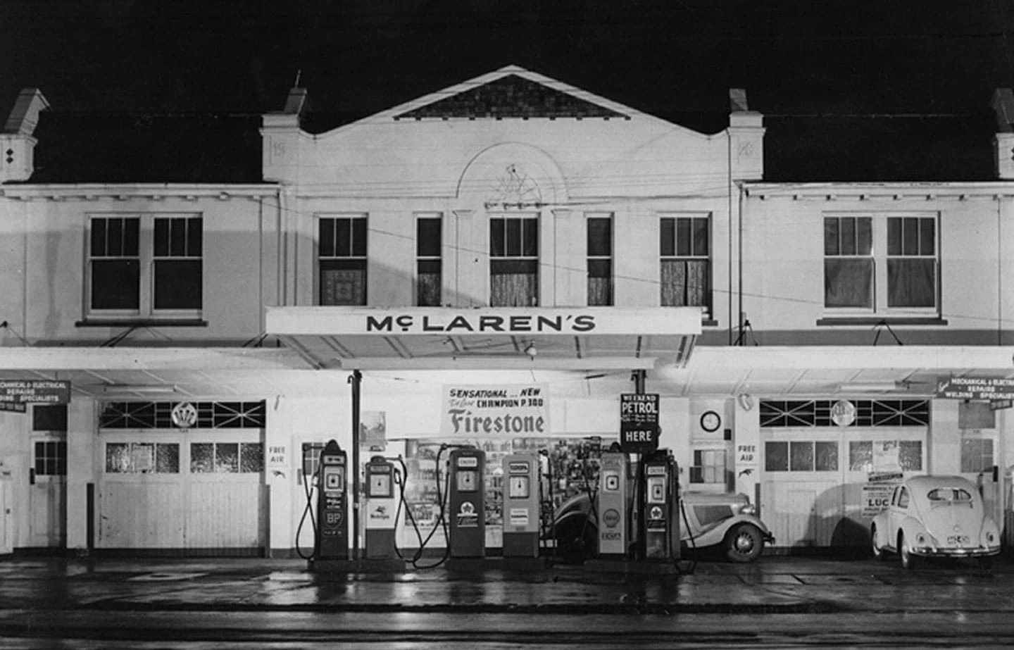
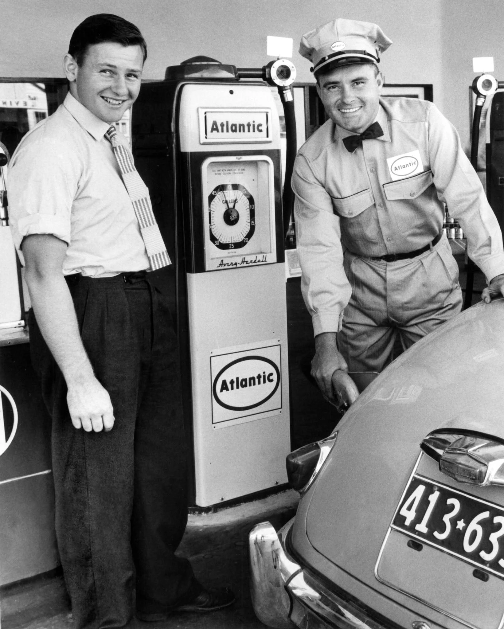
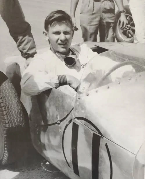
McLaren has introduced an evolved visual identity across its Racing and Automotive businesses. At the centre is a redesigned wordmark inspired by the workshop where Bruce McLaren's story began. But the refresh raises a broader branding question, how do you modernise an iconic name without losing what made it recognisable? On September 22, 2026, McLaren unveiled a new visual identity designed to bring its racing heritage and automotive ambitions under a more connected brand system. The announcement covers both McLaren Racing and McLaren Automotive, extending the refresh beyond Formula 1 into road cars, merchandise, digital platforms and the wider McLaren experience. Rather than introducing a completely unfamiliar symbol, McLaren has looked back to its origins. The new wordmark takes inspiration from the sign above the family service station in Remuera, Auckland, owned by Bruce McLaren's parents, Les and Ruth McLaren. It was there that Bruce worked on the car that would take him to his first racing victory. For a brand built around speed and innovation, the decision to revisit its earliest visual identity is an interesting one. McLaren is attempting to make its future feel connected to its history.
What changed in McLaren's new logo?
The most noticeable change is the typography. McLaren has moved away from the familiar italicised wordmark associated with its modern racing and automotive identity, introducing a more restrained typographic treatment. The refreshed wordmark includes a distinctive treatment of the letter C, inspired by the original McLaren family service station signage, with a subtle underscore beneath the lowercase c adding a further point of polish. The established Speedmark remains part of the identity, but its relationship with the wordmark has changed. Rather than functioning as an integrated extension of the lettering, it is presented as a more distinct brand element. From a design perspective, this is more than a minor adjustment. The previous logo communicated movement directly through its forward-leaning typography. The new identity places greater emphasis on heritage, structure and typographic distinction. It shifts some of the brand's visual expression from immediate speed toward a broader luxury and performance identity.
The original McLaren workshop becomes the foundation
The historical reference is arguably the most important part of this refresh. McLaren could have created an entirely new geometric logo, simplified its existing symbol or followed the familiar direction of contemporary automotive rebrands. Instead, the company returned to an early expression of its name, referencing signage dating back to the 1920s. The decision connects the present-day organisation to Bruce McLaren's beginnings in New Zealand, before the company became an internationally recognised racing and automotive brand. McLaren says its Racing and Automotive teams worked with their shared archives to identify the symbols, stories and design details that could inform the evolved identity. This gives the new wordmark a reason to exist beyond aesthetics. It is not simply a new typeface selected because it looks contemporary. It is intended to make the founder's story visible within the modern brand. For heritage brands, that distinction matters. A visual identity becomes more meaningful when its design decisions can be connected to something distinctive about the organisation.
Papaya remains. The visual language expands.
McLaren has retained its signature Papaya colour, one of the most recognisable elements of its contemporary racing identity. The colour continues to connect the brand to its motorsport heritage, while an expanded palette introduces additional heritage-inspired colours across automotive, racing and lifestyle applications. The identity also retains the Speedy Kiwi, a historical symbol referencing Bruce McLaren's New Zealand roots. This is an important distinction. McLaren has not abandoned every recognisable element of its existing brand. Instead, it is reorganising those elements within a new system. The result is intended to create consistency without making every McLaren product or experience look identical. A Formula 1 team, a performance road car and a luxury ownership experience have different communication requirements. The challenge is making all three feel like they belong to the same brand.
Why McLaren is refreshing its identity now
The timing is significant. McLaren Automotive recently confirmed a £500 million UK investment programme to expand its manufacturing and engineering operations, expected to create at least 1,000 direct and indirect jobs by 2032. The company is also preparing to move beyond its traditional two-seat supercar portfolio with a performance SUV targeted for 2030, alongside plans to bring powertrain development in-house for the first time in its history. Meanwhile, McLaren Racing is expanding its ambitions across Formula 1, IndyCar and endurance racing. Its MCL-HY Hypercar is set to compete for overall honours in the FIA World Endurance Championship and the 24 Hours of Le Mans from 2027, a programme that would complete McLaren's pursuit of motorsport's Triple Crown, victory at the Monaco Grand Prix, the Indianapolis 500 and Le Mans. These developments suggest that the refresh is not simply a cosmetic exercise. McLaren is preparing its brand for a broader business. A visual identity developed primarily around racing performance must now support a more complex ecosystem of products, experiences, partnerships and customers. That requires a system capable of working across different environments while maintaining a recognisable identity.
The design debate: has McLaren lost some of its speed?
The announcement has also generated criticism among Formula 1 fans. In discussions following the reveal, some fans argued that the previous wordmark communicated speed more effectively through its italicised lettering and integrated Speedmark. Others questioned whether the new typography feels too restrained for a company associated with motorsport and high-performance engineering. This reaction highlights a familiar challenge in brand refreshes. Visual simplicity and brand recognition are not the same thing. A cleaner identity can improve consistency, legibility and flexibility across digital and physical applications. But simplifying or restructuring a familiar logo can also remove characteristics that audiences associate with its personality. In McLaren's case, the previous wordmark had an unmistakable sense of forward motion. The new version asks other parts of the brand system, including imagery, colour, motion and the Speedmark, to communicate more of that energy. Whether that works will depend on how the identity is applied beyond the initial reveal. A logo rarely tells the whole story of a brand system.
A brand refresh is more than a new logo
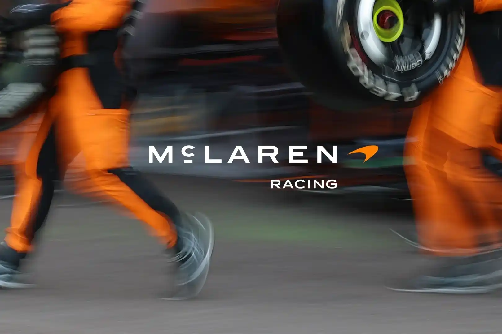
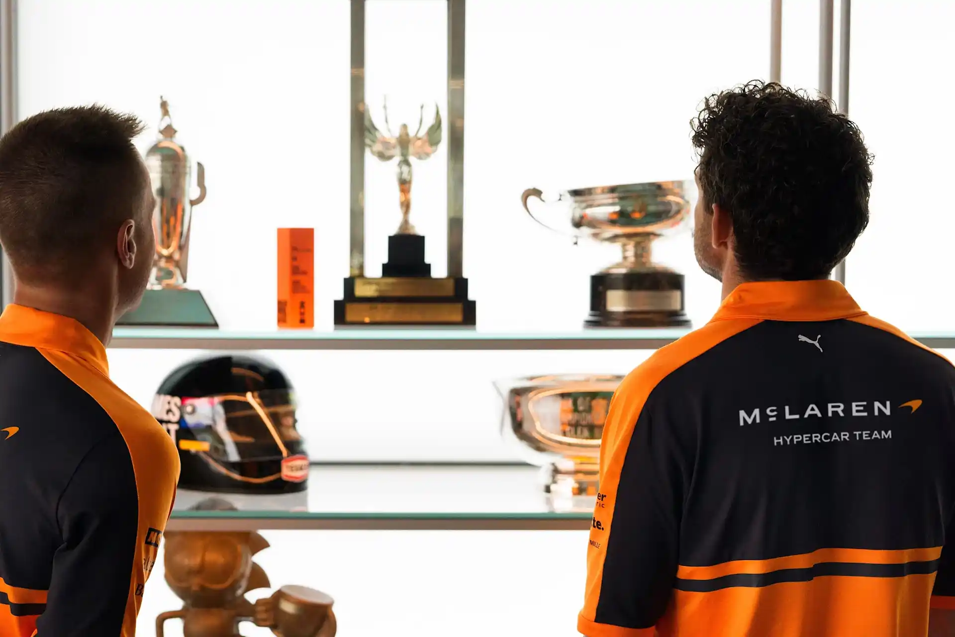
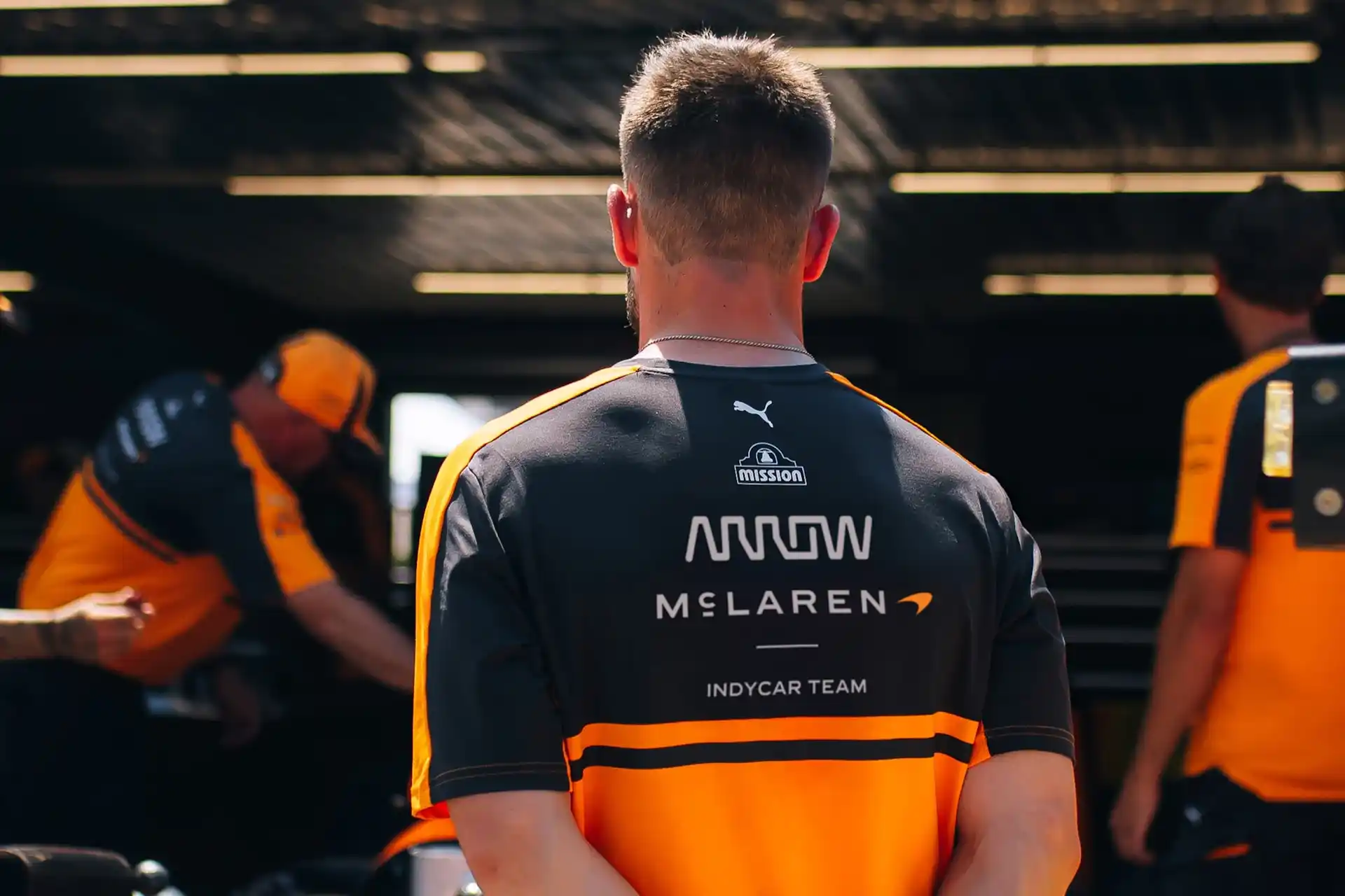
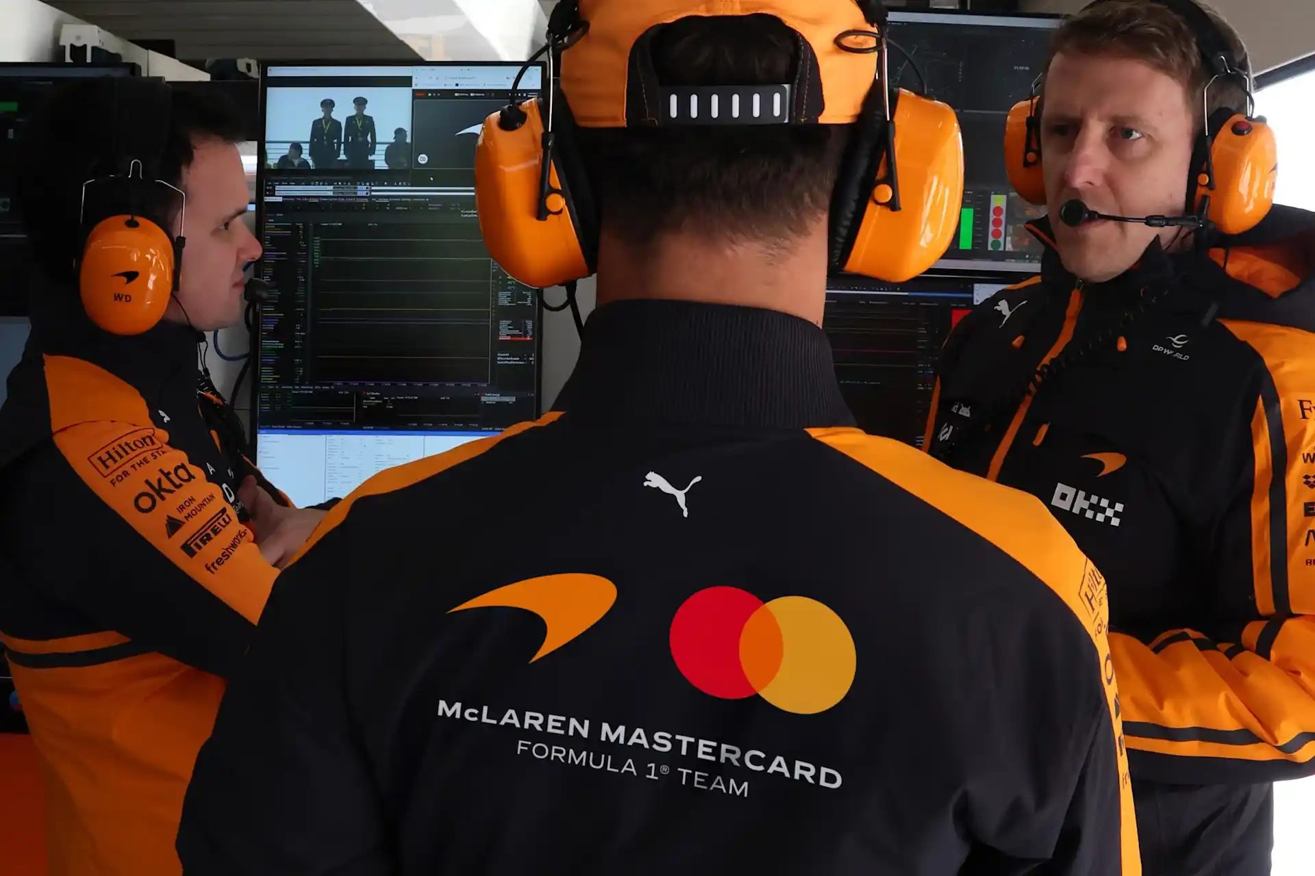
McLaren's announcement includes applications across racing categories and team apparel, demonstrating how the evolved identity is intended to function beyond a standalone logo. This is where the practical success of a rebrand becomes clearer. A modern identity needs to operate across websites, mobile screens, merchandise, vehicle surfaces, sponsorship environments, social media and physical spaces. It also needs to remain recognisable when the logo is small, partially obscured or surrounded by other brands. For McLaren, that challenge is particularly demanding because motorsport introduces high-speed viewing conditions and crowded sponsorship environments. A wordmark that looks elegant on a presentation slide must also work on a moving racing car, a driver's suit and a mobile interface. The strongest brand systems are designed for all those situations, not only for the launch announcement.
What brands can learn from McLaren's refresh
McLaren's evolution offers a useful case study for businesses considering their own identity refresh. The first lesson is that a brand does not always need to invent something new to move forward. Sometimes the most distinctive visual reference already exists within its history. The second is that recognisable assets can survive a substantial redesign. McLaren has retained Papaya, the Speedmark and the Speedy Kiwi while changing how those elements work together. The third is that a refresh should support a business direction. McLaren's identity is evolving as its racing, automotive and ownership experiences expand, giving the visual changes a clear strategic context. Finally, the reaction to the new wordmark demonstrates why emotional recognition matters. People do not experience brands as collections of design components. They recognise familiar shapes, colours, proportions and visual behaviours built up over years of exposure. Changing those characteristics requires more than a convincing presentation. It requires consistent execution over time.
Looking backward to move forward
McLaren's new identity illustrates the difference between refreshing a logo and evolving a brand. The historical concept gives the wordmark a clear narrative foundation. Retaining established assets provides continuity. Bringing Racing and Automotive into a more connected system supports the company's expanding ambitions. At the same time, the redesign changes one of the most expressive characteristics of McLaren's previous identity, its immediate sense of speed. That creates an interesting creative tension. The new system may offer greater flexibility across luxury automotive and lifestyle applications, while the racing identity must continue communicating the energy that audiences associate with McLaren. The wider lesson is relevant far beyond motorsport. A successful brand refresh should preserve what makes a business recognisable while giving it the flexibility to become something more. McLaren has chosen to look backward to establish the visual foundation for its next chapter. How effectively that identity communicates the brand's future will become clearer as it appears across cars, racing environments, digital experiences and the wider McLaren world.
This article is an independent brand identity case study by Darwin Corp. McLaren's identity was developed and announced by McLaren and its teams. Darwin Corp was not involved in the redesign. View McLaren's official identity announcement: https://www.mclaren.com/racing/2026/mclaren-announces-evolved-identity/
Frequently asked questions
McLaren introduced an evolved visual identity on September 22, 2026, unifying its Racing and Automotive businesses under one connected brand system as the company expands into a performance SUV, in-house powertrain development and a broader motorsport programme including Formula 1, IndyCar and its 2027 WEC Hypercar entry.
The new wordmark is inspired by the sign above the family service station in Remuera, Auckland, owned by Bruce McLaren's parents, Les and Ruth McLaren, where Bruce worked on the car that took him to his first racing victory. The design references signage dating back to the 1920s.
Yes. McLaren retained its signature Papaya colour and the Speedmark, along with the Speedy Kiwi symbol referencing Bruce McLaren's New Zealand roots, while introducing an expanded, heritage-inspired colour palette and repositioning the Speedmark as a more distinct brand element.
Some fans feel the previous italicised wordmark and integrated Speedmark communicated speed and motorsport energy more directly, and have questioned whether the new, more restrained typography feels too reserved for a performance and racing brand.
Yes. The refresh coincides with a £500 million UK investment programme, a performance SUV planned for 2030, in-house powertrain development, and McLaren Racing's expansion across Formula 1, IndyCar and its upcoming FIA World Endurance Championship Hypercar programme starting in 2027.