
Brisbane 2032's New Olympic Identity Turns a Cockatoo Into a Global Symbol
Brisbane 2032 swapped abstract geometry for two native cockatoos, one pink for the Olympics and one sulphur-crested for the Paralympics. It's a case study in how a global event can become memorable by being unapologetically local.
Summary
Brisbane 2032 launched its Olympic and Paralympic emblems on October 5, 2026, after an accidental YouTube leak. A pink cockatoo represents the Olympics and a sulphur-crested cockatoo the Paralympics. Their crests trace Queensland's outline, their feathers form the Games flames, and the feather count nods to 2032. The identity trades abstraction for personality, and it stands apart from Sydney 2000's landmark-and-athlete approach.
Brisbane 2032 has unveiled its official Olympic and Paralympic emblems, replacing the temporary transition mark with a much more character-driven identity built around two native Australian cockatoos. The result is playful, highly local and intentionally different from the polished geometric identities often associated with global sporting events.
The official Brisbane 2032 Olympic and Paralympic emblems were unveiled in early October 2026, marking one of the most important visual milestones in the lead-up to Australia's next Summer Games. The identity introduces two native birds at its centre, a pink cockatoo for the Olympic Games and a sulphur-crested cockatoo for the Paralympic Games.
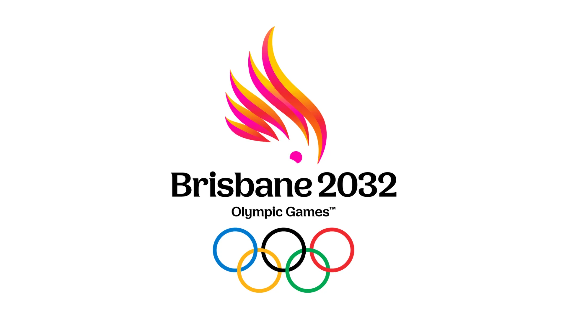
At first glance, the decision feels almost deliberately informal. Olympic identities are usually expected to communicate scale, prestige and international importance. Brisbane 2032 instead begins with something more familiar, a bird with personality.
That makes the identity immediately interesting from a branding perspective. Rather than trying to create an abstract universal symbol first and explain its connection to place afterward, Brisbane has done the opposite. It starts with Queensland.
Why a cockatoo?
The cockatoo is native to Australia and strongly associated with Queensland's environment and character.
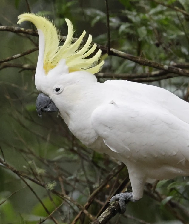
Brisbane 2032 says the birds were chosen for their playful and inquisitive personalities. The pink cockatoo represents the Olympic Games, while the sulphur-crested cockatoo represents the Paralympic Games.
But the emblems go further than simply placing a bird above the Olympic rings. Several references are built into the forms. The crest of each cockatoo takes the outline of Queensland, while the feathers are shaped like the Olympic and Paralympic flames. The five feathers are arranged with three on one side and two on the other, a subtle reference to the year 2032. The cockatoos also carry First Nations significance, with cultural roles as messengers connecting people to place, story and ceremony.
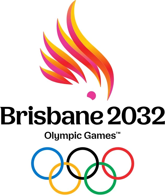
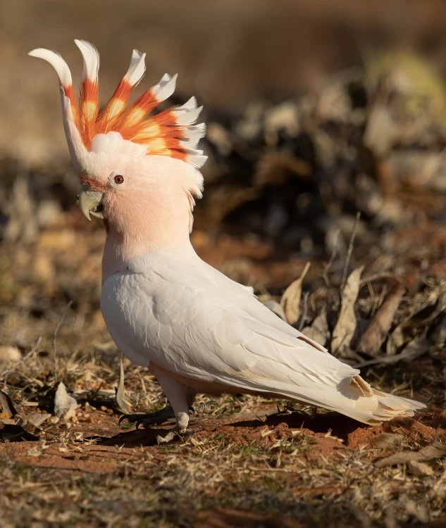
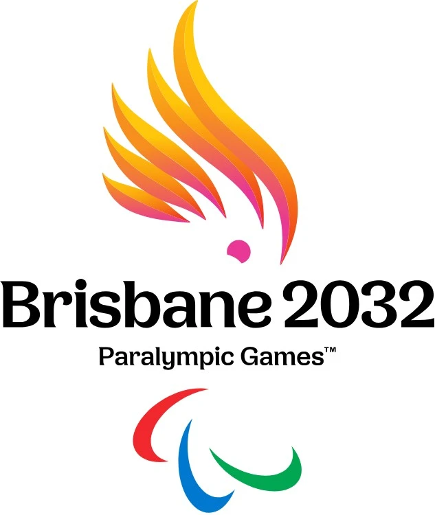
That layering matters. A successful event identity needs to do more than look recognisable on a poster. It has to become a shorthand for place, culture and memory. Brisbane 2032 is attempting to compress all three into one character.
The Olympic and Paralympic identities are related, but not identical
One of the strongest decisions is that Brisbane 2032 does not simply reuse the same mark for both Games. The two identities belong to the same visual family, but each has its own bird.
| Element | Olympic identity | Paralympic identity |
|---|---|---|
| Central character | Pink cockatoo | Sulphur-crested cockatoo |
| Core symbolism | Queensland, flame, 2032 | Queensland, flame, 2032 |
| Games symbol | Olympic rings | Paralympic Agitos |
| Typography | Bespoke Brisbane 2032 signature | Same broader identity system |
| Overall approach | Playful, local, expressive | Related but independently recognisable |
The approach gives the Paralympic identity more independence than simply attaching a different institutional symbol beneath the same graphic. That is a small but important branding decision. It allows both events to feel connected while retaining their own personality.
Brisbane is choosing personality over abstraction
This is where the identity becomes particularly interesting.
Recent Olympic branding has often leaned toward flexible graphic systems, typography, geometry and movement. Brisbane 2032 takes a much more literal route. There is a bird. It has a recognisable silhouette. It has character. And it clearly belongs to Australia.
From a pure modernist branding perspective, that can feel risky. Literal symbols can become overly illustrative or feel less sophisticated than abstract marks. But they can also create something abstract systems sometimes struggle to achieve, instant emotional recognition.
It is also very different from Sydney 2000
Any Australian Olympic identity will inevitably be compared with Sydney 2000.
That emblem became one of the most recognisable Olympic marks of its era, combining the silhouette of an athlete with references to the Sydney Opera House and the Olympic flame. Brisbane 2032 is taking a very different route. Instead of representing the host city primarily through architecture or athletic motion, the new identity focuses on wildlife and character.
That shift says something important about how place branding has changed. Cities no longer necessarily need to represent themselves through landmarks alone. Culture can come through colour, personality, landscape, wildlife and local behaviours. Brisbane 2032 is effectively saying that Queensland itself is the brand.
The reveal did not go exactly as planned
Interestingly, the identity became public slightly earlier than intended.
Reuters reported that Brisbane 2032's official YouTube channel accidentally published an emblem explainer video about three days before the planned launch, exposing the designs early. The organising committee then posted images of the logos on social media with the line "Consider this your official reveal," before holding the formal launch on Monday, October 5. Chief marketing officer Brent Hill acknowledged the misstep, noting that if the team had their time over there may be different ways to do it, while adding that the reaction had been positive.
From a communications perspective, that creates an unusual launch story. Brand reveals of this scale are normally tightly controlled. Teasers, press releases, athlete appearances, social content and physical installations are carefully sequenced to create a single moment. Brisbane had planned a broader rollout across Queensland, with pieces of the identity revealed in different locations before being brought together. Instead, part of the mystery disappeared early.
Yet the leak may actually have increased attention. It transformed what could have been a conventional identity announcement into a news story. For brands, that is a useful reminder that once an identity enters the public domain, audience reaction becomes part of the launch whether the rollout is ready or not.
The rollout itself is part of the identity
The planned reveal was geographically ambitious. Olympic, Paralympic and sporting figures took part in a series of reveals across Queensland, including locations around Cairns, Townsville, Rockhampton, the Sunshine Coast and the Gold Coast. The locations included the Great Barrier Reef, Castle Hill, Rockhampton's Riverside Precinct, Wildhorse Mountain and Currumbin Beach. The separate elements were later brought together in Brisbane's South Bank.
This is a strong branding decision because the launch itself reinforces the central message. Brisbane 2032 is not only about Brisbane. It is representing Queensland more broadly. The identity therefore acts as both an event mark and a form of regional branding.
That matters because Olympic host identities are increasingly expected to generate tourism interest, investment and long-term recognition well before the opening ceremony.
A logo that has six years to grow
One of the unusual things about Olympic branding is the amount of time an identity has to exist before the event itself. Brisbane 2032 is still years away, which means this emblem needs to survive a long lifecycle. It will appear across sponsorships, construction sites, ticketing, merchandise, digital experiences, volunteer programmes, venues, transportation, broadcasts and eventually billions of screens during the Games.
The emblems are separate from the Games mascot, which will be revealed closer to the Games. That distinction is particularly interesting. The cockatoos already behave almost like characters, yet they are not the mascots. That creates a potentially powerful system where the emblem itself has far more personality than a conventional event mark.
It also creates a challenge. Brisbane will need to ensure the future mascots complement the identity rather than compete with it.
Does it look like an Olympic logo?
This may become the biggest debate around the design.
The new identity does not immediately resemble the kind of global sports emblem people may expect. And that may be intentional. Many modern identities have become increasingly polished, geometric and interchangeable. Remove the text from enough corporate marks and it can become difficult to identify what country, organisation or event they belong to.
Brisbane 2032 avoids that problem. The cockatoo may divide opinion, but it is difficult to mistake for another host city. That is valuable. Brand identity is not simply about creating something everyone finds aesthetically pleasing. It is also about creating something people can recognise, remember and associate with a specific idea. In that sense, distinctiveness can matter more than neutrality.
What brands can learn from Brisbane 2032
The first lesson is local specificity. Global brands often become afraid of being too local because they need to communicate across different countries and cultures. But global recognition does not necessarily require generic design. Sometimes the most internationally memorable identity begins with something extremely specific.
The second lesson is that meaning can be layered without making the design incomprehensible. Queensland, wildlife, the flame, the Games year and cultural references all sit within the same emblem.
The third is personality. A symbol does not always need to communicate seriousness in order to communicate importance. Brisbane 2032 is hosting one of the largest sporting events in the world, yet it has chosen an emblem that feels approachable and playful. That confidence is part of what makes the identity interesting.
The Darwin Corp perspective
Brisbane 2032 demonstrates something that is increasingly relevant in modern branding, global does not have to mean generic.
The easiest way to design for an international audience is often to remove specificity. Simplify everything. Reduce the cultural references. Make the shapes cleaner. Make the system safer. Brisbane has moved in the opposite direction. Its identity becomes global precisely because it is so clearly connected to one place.
The cockatoos are not trying to represent every country that will participate in the Games. They represent Queensland. The Olympic and Paralympic symbols provide the global recognition. The rest of the identity is free to communicate where these Games belong.
That balance is what makes the system worth studying. Whether audiences ultimately love the bird or dislike it may be less important than whether they remember it. And six years before the opening ceremony, Brisbane 2032 has already created something difficult for any global brand to achieve, an identity people are talking about.
Frequently asked questions
The Brisbane 2032 emblems feature two native Australian cockatoos, a pink cockatoo for the Olympic Games and a sulphur-crested cockatoo for the Paralympic Games. The crests take the outline of Queensland, the feathers are shaped like the Olympic and Paralympic flames, and the feather arrangement subtly references 2032.
The emblems were officially launched on October 5, 2026, after the Games' official YouTube channel accidentally published an explainer video a few days early. Organisers responded by posting the logos online and treating it as the official reveal.
Organisers say the birds were chosen for their playful, inquisitive personalities and their strong association with Australia and Queensland. The cockatoos also carry First Nations significance as messengers connecting people to place, story and ceremony.
No. The cockatoo emblems are separate from the Games mascot, which will be revealed closer to the Games.
Sydney 2000 represented the host city through an athlete silhouette, the Opera House and the Olympic flame. Brisbane 2032 instead focuses on native wildlife and character, using Queensland itself as the foundation of the brand.