
When Nostalgia Becomes a Branding Disaster: The Atlanta Falcons Logo Controversy
The Atlanta Falcons’ retro profile picture drew Nazi-imagery comparisons within hours.
Summary
The Falcons posted a throwback falcon-on-stripes graphic on October 21 and critics compared it to Nazi-era imagery. The team swapped it for a helmet image, and a logo historian saw no ill intent. The lesson: heritage design needs context.
The Atlanta Falcons revived a historic design for a throwback campaign. Within hours, critics were comparing the resulting imagery to Nazi-era symbols, and the team replaced its social profile graphic. A sports logo historian cautioned against assuming malicious intent. The episode is a useful case study in how heritage design can fail when it is stripped of context.
Retro branding is one of the safest-looking strategies in sport. Fans love history, throwback kits sell, and an old logo carries emotional weight that a new one has to earn. But nostalgia has a hidden risk: a design that made sense in its original setting can mean something very different when it is lifted out of that setting and posted as a standalone image.
What happened
On Wednesday, October 21, 2026, the Falcons posted a black-and-white falcon over red, white and black stripes on Instagram and X, labelled "New PFP", shorthand for a new profile picture. It appeared to be a tribute to the team's 1966 expansion-season look.
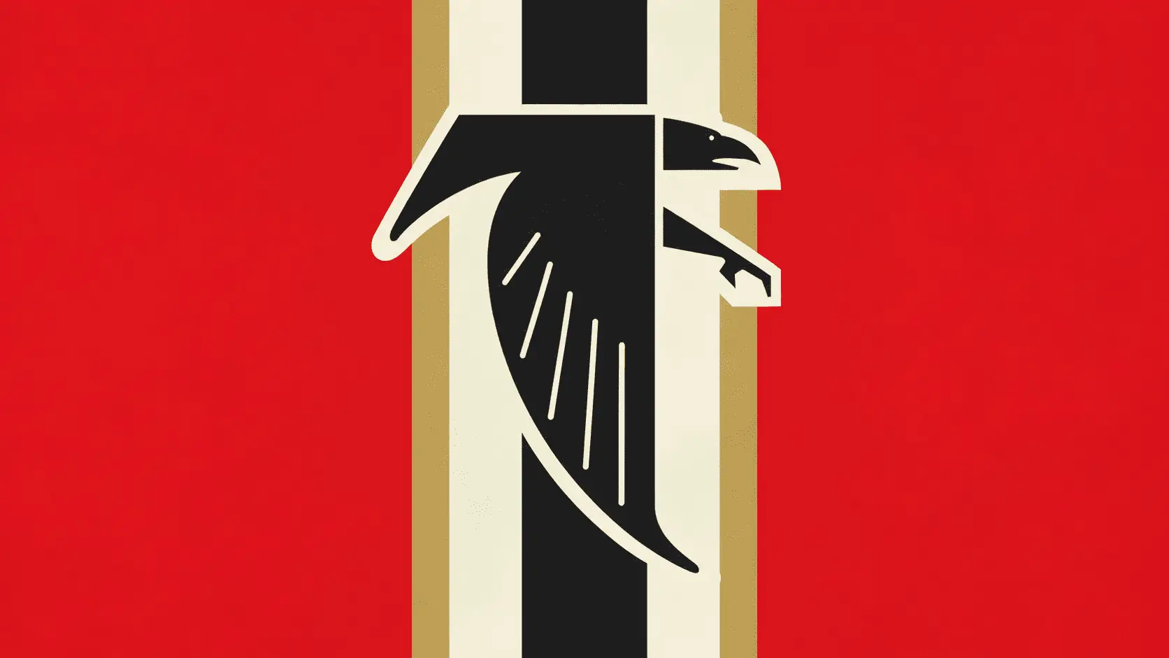
Reaction was swift. Critics compared the stripes and layout to the Nazi-era Reichskriegsflagge, and some said they saw a resemblance to a swastika. Users edited the falcon onto images of historic rallies and marching soldiers. Not everyone agreed with the comparison, but the volume of it was enough to dominate the conversation around the post.
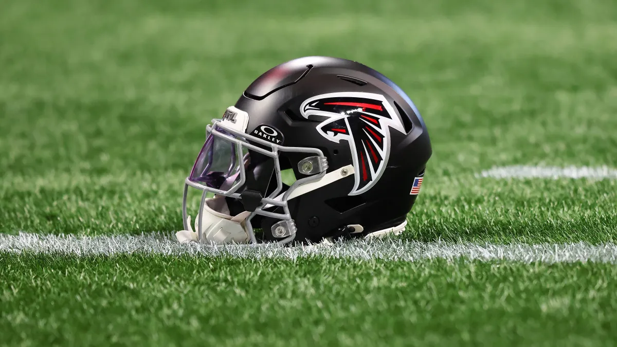
A team representative said the Falcons do not have a "new logo" and declined further comment. Within a day or two, the team changed its profile pictures on X and Instagram to an image of its red throwback helmet with the black falcon crest and no vertical stripes. The original post stayed up. Reports also said the stripes will appear down the centre of the helmet rather than behind the logo, as the graphic had shown.
The design had a real history
This was not an invented design. According to the team's own helmet history, the Falcons' inaugural 1966 look featured a red shell, grey facemask and a black falcon crest outlined in white, with a central black stripe bordered in white and gold. The colours tie to the University of Georgia (red and black) and Georgia Tech (white and gold), giving the original a regional logic.

Sports logo historian Chris Creamer said there was "absolutely no ill intent." That matters. The evidence points to a heritage mistake rather than a deliberate provocation, and responsible criticism should not invent motives.
Why it went wrong: context was removed
A helmet gives a design its meaning. The shell, facemask and placement of the crest tell the viewer immediately that this is American football heritage. The Falcons instead posted an isolated graphic, a flat bird on stripes, in a square profile-picture crop. Without the helmet, viewers had only shapes, colours and their own associations.
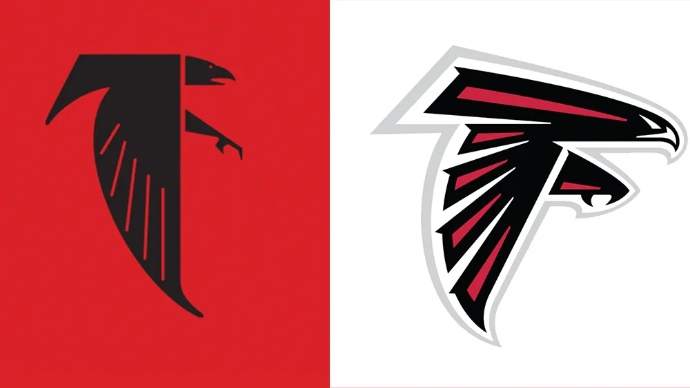
Two things made that worse. First, the post arrived through social media, where images are judged in seconds and screenshots travel faster than explanations. Second, the Falcons had faced similar comparisons before. FOX 5 Atlanta and Creative Bloq documented a comparable reaction to a retro falcon post in September 2024. It is not established that the two graphics were identical, and nothing shows current decision-makers knew about the earlier episode. But the precedent shows the risk was foreseeable.
The response: quick change, no explanation
The team's response was fast but thin. Replacing the profile picture removed the image that caused the problem, and the move to a red helmet showed that a better presentation was available all along. But a changed picture is not an explanation. The Falcons offered no detailed statement about the thinking behind the post, so the story of the backlash stayed in the hands of critics and commentators.
For a brand, there is a real trade-off. A longer statement can amplify a controversy and look defensive. Silence can look evasive. The strongest approach is usually a short, specific line that states the intention, acknowledges how it was received, and says what changes.
Lessons for brands using heritage design
| Lesson | What it means in practice |
|---|---|
| Heritage is not the same as context | An old design needs its original setting. Show the product, uniform or situation it came from. |
| Test the image in isolation | Crop it to a profile picture, a thumbnail and a screenshot. Ask what a stranger would see. |
| Check for unintended associations | Review colours, stripes, symbols and layouts against historical and political imagery, including from other countries. |
| Learn from your own history | If a similar design drew criticism before, treat that as data, not as ancient history. |
| Assume the worst reading will travel | You do not need to agree with a criticism to plan for it. |
| Respond with substance | Swap the asset if necessary, but pair it with a clear sentence about intent and next steps. |
The Darwin Corp perspective
The Falcons episode is not really about one bird. It is about the gap between what a brand knows and what its audience sees. Inside the organisation, the 1966 design is a loved piece of franchise history. Outside it, a square image of a bird on stripes has no franchise history at all. Brand teams are often too close to their own assets to see this gap.
Heritage is a powerful brand asset because it signals authenticity. But authenticity is not a defence. When you revive an old identity, you take on responsibility for how it reads today, not only for how it read when it was created. That requires a review step most teams skip: look at the work with fresh eyes, in its smallest and least favourable format, and ask what else it could mean.
The practical fix here was simple, and the team found it within a day. Show the helmet. Keep the history. Give the design back its context. The cost of getting there first would have been a short design review. The cost of getting there second was a news cycle.
Frequently asked questions
On October 21, 2026, the Falcons posted a retro black-and-white falcon over red, white and black stripes as a new social profile picture. Critics compared it to Nazi-era imagery, and the team later replaced the graphic.
No. A team representative said the Falcons do not have a "new logo." The graphic was a throwback image inspired by the team's 1966 look.
There is no evidence of that. Sports logo historian Chris Creamer said there was "absolutely no ill intent." The criticism concerned how the image looked out of context, not the team's motives.
They changed their X and Instagram profile pictures to a red throwback helmet with the black falcon crest and no vertical stripes, and said the stripes will run down the centre of the helmet. They did not issue a detailed public explanation.
Heritage designs need context, should be tested in small and isolated formats, and should be checked for unintended associations. Brands should also pair a quick fix with a clear statement of intent.