
Arsenal's New Rocastle Typeface Turns Football Heritage Into a Modern Brand System
Arsenal spent over four years building Rocastle, a bespoke blackletter typeface named after club legend David Rocastle. It completes a type system that lets the club speak differently in football, community and culture, and shows how a mature brand can grow by strengthening everything around its logo.
Summary
Rocastle is a three-weight blackletter typeface designed by David Rudnick with Léa Bruneau for Arsenal. It completes a system with Northbank (team) and Chapman (community), and is reserved for moments where the club shows up in culture. It is named after David "Rocky" Rocastle and built from Arsenal's own archive, alongside a new standalone "A" called The Capital. The lesson for brands is to strengthen what surrounds the logo rather than redesign the logo.
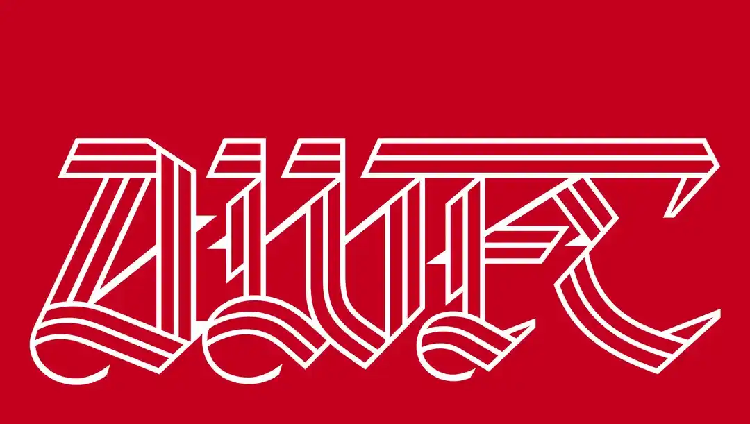
Arsenal has introduced Rocastle, a bespoke blackletter typeface designed by David Rudnick and developed over more than four years. Named after club legend David Rocastle, the typeface is not simply a new font. It is the final piece of a wider visual system built to help Arsenal communicate across football, community, fashion, music, art and culture without losing the identity supporters already recognise.
Football clubs increasingly behave like global lifestyle brands. They still have teams, stadiums and matchdays at their centre, but their visual identities now need to work far beyond the pitch.
A modern club appears on social media every hour. It launches fashion collaborations. It produces documentaries, merchandise, events, exhibitions and cultural campaigns. It needs to communicate with supporters in London, Dubai, Lagos, New York and Tokyo without losing the feeling that makes the club distinct.
Arsenal's latest design project addresses exactly that problem. The club has introduced Rocastle, a bespoke three-weight blackletter type family developed with designer David Rudnick and Léa Bruneau at his studio, Terrain. The project draws from more than a century of Arsenal's visual history and takes its name from the late David "Rocky" Rocastle, one of the club's most admired players.
For Darwin, what makes the project interesting is that Arsenal has not treated typography as decoration. It has treated typography as brand architecture.
Why Arsenal needed more than one font
The starting point for Rocastle was a broader brand strategy Arsenal updated in 2021 and 2022.
According to Arsenal Creative Studio lead Johnnie Campbell, research with supporters around the world revealed that Arsenal's identity now operates across three broad spaces. Team, everything surrounding the intensity of the match itself. Community, Arsenal's relationship with supporters and communities beyond the 90 minutes. And culture, where the club intersects with fashion, music, art and design.
That led Arsenal to something unusual. Instead of forcing one typeface to communicate every part of the organisation, the club built different typographic voices for different situations.
| Typeface | Role in Arsenal's system | Intended tone |
|---|---|---|
| Northbank | Team | Immediate, energetic, match-focused |
| Chapman | Community | Editorial, conversational, supporter-focused |
| Rocastle | Culture | Distinctive, expressive, heritage-driven |
Rocastle completes that system. Arsenal can look different when announcing a goal than when publishing a long-form supporter story or launching a fashion collaboration, while all three expressions still belong to the same club. Campbell describes it as one main Arsenal voice with different tones, because celebrating a goal at the Emirates is very different from talking about a commercial partnership or a new fashion drop.
That is a sophisticated way to think about identity. Most brands ask, what is our font? Arsenal asked, how should our voice change depending on where the brand appears?
Rocastle comes directly from Arsenal's history
Rocastle is rooted in the club's existing gothic visual language.
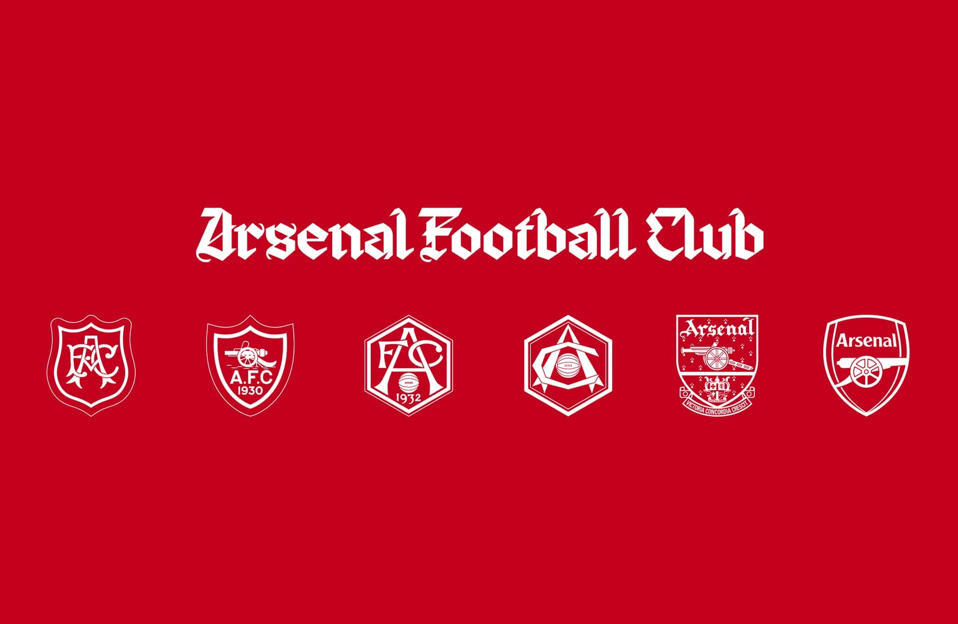
The production team worked through the Arsenal archive, including gothic crests, paper season tickets, programmes and the memorabilia saved by supporters over decades. The typeface takes particular inspiration from the club's gothic wordmark and the historic Victoria Concordia Crescit crest.
Rudnick's challenge was therefore not to invent something that merely looked old. Arsenal already had blackletter letters in its wordmark, but they were not a typeface. He had to take forms supporters already recognised and transform them into a complete working system.
That is significantly harder. Historic lettering may contain only a limited number of characters. A functional typeface needs an entire alphabet, punctuation, different weights and a consistent structural logic.
Rudnick described the challenge as creating something that felt modern, English and totally new, while pulling off a magic trick for the millions of supporters who had seen those letters hundreds of times, it had to feel like the voice of the club they love. Almost every letter in Rocastle is unique to the system. He recalled showing Campbell iteration 2,000 of the letter G during the multi-year process.
That level of development is unusual in sports branding. It also explains why this is more interesting than simply changing a logo.
Why call it Rocastle?
The name gives the project much of its emotional weight.
David Rocastle joined Arsenal at 15 and made 277 appearances for the club during the late 1980s and early 1990s. He helped Arsenal win league titles in 1989 and 1991 and became remembered not only for his ability but for hard work, humility and loyalty. He died in 2001 at the age of 33 from non-Hodgkin lymphoma. At matches today, supporters still chant his name.
Rudnick, himself a lifelong Arsenal supporter, said the name was important from almost the first letters of the project. Arsenal, he explained, extends far beyond minutes, seasons or even decades. Nothing spoke more to that eternal idea of the club than Rocky. There is also something fitting in the word itself, there is something medieval about "castle," while who Rocky was remains modern and present for every fan.
Naming the typeface after him turns the design into more than an archival reference. Every time Rocastle appears, it carries part of that story. That is powerful brand building.
There is another story hidden inside the letterforms
One of Rocastle's most interesting details appears in its hero weight. A continuous line runs through the letterforms.
Visually, it adds rhythm and movement. Conceptually, it represents the enduring bond between Arsenal supporters in London and around the world. It also echoes movement through London itself. Arsenal began in Woolwich in south-east London before moving north to Highbury, and Campbell notes that the club's story parallels London's, movement from south to north and people coming together to create something bigger than the individual parts.
The line therefore becomes both a graphic device and a geographic narrative. This is a small detail most viewers may never consciously notice. But that is often where strong identity systems become interesting. Not every piece of meaning needs to be explained every time. Sometimes the story simply needs to exist inside the design.
Arsenal also introduced The Capital
Rocastle was revealed alongside another new asset called The Capital.
The Capital is a standalone "A" designed to complement Arsenal's existing crest. It gives the club another recognisable symbol that can operate independently in cultural environments where using the full badge may be unnecessary or visually restrictive. That could prove particularly valuable across fashion collaborations, merchandise, music, cultural events, social graphics and lifestyle products.
The approach resembles something increasingly common among mature global brands. Rather than expecting one logo to perform every job, the brand develops an ecosystem of recognisable assets. Arsenal now has its crest, cannon, gothic references, bespoke typography and standalone letterforms. Together, these create much more flexibility than a single badge ever could.
The typeface is intentionally not for everything
Perhaps the smartest decision is that Arsenal does not plan to use Rocastle everywhere.
Campbell was deliberately mysterious about where it will appear, saying it will be saved for the very best moments, especially where Arsenal shows up in culture. It will be "few and far between."
This restraint matters. One of the easiest ways to destroy the impact of a distinctive visual asset is to use it constantly. If Rocastle appeared on every social post, fixture graphic, email and corporate presentation, its distinctiveness would quickly disappear. Instead, Arsenal is treating it almost like a premium voice.
Northbank can handle the intensity of match communication. Chapman can handle broader community and editorial communication. Rocastle can appear when the club wants something to feel culturally significant. That makes typography function almost like tone of voice. Not every sentence should be shouted. Not every message should sound formal. And not every piece of communication needs the strongest visual expression available.
The launch happened at the Design Museum, not a football stadium
That choice is also significant.
Rocastle's release was celebrated with a public conversation between Rudnick, Campbell and It's Nice That at London's Design Museum on October 9, alongside Arsenal by Design, an exhibition that ran on October 10 and 11. Rudnick had also shared the typeface on social media first, saying he wanted supporters to be the ones to see it before anyone else.
Launching a football identity inside one of London's major design institutions makes a clear statement. Arsenal is positioning its visual culture as something worth discussing independently from results on the pitch. That would have seemed unusual for most football clubs a generation ago. Today, it makes perfect sense. Football sits inside fashion, music, street culture, entertainment and design. As Rudnick put it, football clubs are equivalent to the biggest pop stars on the planet, yet traditionally they have not designed anything, because their product is football.
Why football clubs are becoming design systems
There was a time when the essential components of a football identity were relatively simple. A crest. Club colours. A shirt. Perhaps a particular style of programme typography.
Today the environment is completely different. A club may need to appear on a smartphone screen at 100 pixels wide and on the exterior of an enormous stadium. The same identity needs to work on a football kit, a TikTok video, a luxury fashion collaboration, a match ticket, an app notification and a billboard in another country.
That requires systems rather than individual graphics. Typography becomes especially valuable because it can create recognition even when the crest is absent. A supporter can potentially recognise an Arsenal communication before consciously seeing the word Arsenal. That is the level of identity most global brands try to achieve. Nike has its swoosh. Coca-Cola has its script and red. Apple has its product language. For football clubs, typography is increasingly becoming part of that same recognition system.
Arsenal's approach avoids one of modern branding's biggest problems
A lot of contemporary rebranding converges toward the same visual language. Clean sans-serif typography. Simplified logos. Neutral layouts. Flexible digital systems. There are practical reasons for that approach, but the result can be brands that work technically while losing cultural character.
Arsenal has moved in almost the opposite direction with Rocastle. Blackletter is not neutral. It has historical weight. It has personality. It can be difficult. And that is precisely why it can become distinctive.
The club has not asked, what typography will offend nobody? It has effectively asked, what typography could belong only to Arsenal? Rudnick said he came to the club wanting to build something no other club could have, and that it could never feel egotistical or decorative for its own sake. That is an important distinction.
Heritage is being used as material, not nostalgia
There is always a risk when brands revisit their archives. Heritage can easily become nostalgia. Old crests return. Retro shirts appear. Historic colours are revived. The audience experiences a temporary emotional connection, but the design does little to move the identity forward.
Rocastle works differently. Arsenal's historical typography is not simply being reproduced. It has been studied, reconstructed and expanded into something capable of functioning in a contemporary brand system. That is what makes the project valuable. The archive becomes raw material rather than a museum piece.
The Darwin Corp perspective
Arsenal's Rocastle project demonstrates something that applies far beyond football.
A mature brand does not always need a new logo. Sometimes the next stage of its identity comes from strengthening everything around the logo. Typography. Motion. Photography. Symbols. Sound. Digital behaviour. Tone. Together, these elements can create far more recognition than repeatedly redesigning the primary mark.
Arsenal already has enormous visual equity. Its crest is recognisable. Its red is recognisable. Its cannon is recognisable. The challenge therefore was not to replace those assets. It was to create another layer of expression. Rocastle does that while simultaneously solving a strategic problem, Arsenal needs to communicate as a football club, a community institution and a cultural brand. One visual voice was no longer enough. So Arsenal built several.
And instead of borrowing a fashionable typeface from contemporary design culture, it went into its own archive and created something that theoretically could belong to nobody else. That may be the most useful lesson from the project.
The strongest brand identities do not always come from asking what looks new. Sometimes they come from understanding what was already uniquely yours.
This article is an independent brand analysis by Darwin Corp, based on public reporting and interviews published by It's Nice That and others. The Rocastle typeface was designed by David Rudnick with Léa Bruneau for Arsenal Football Club. Darwin Corp was not involved. Written by Darwin Corp.
Frequently asked questions
Rocastle is a bespoke three-weight blackletter type family designed for Arsenal by David Rudnick with Léa Bruneau at Terrain, developed over more than four years. It is the third typeface in Arsenal's system, alongside Northbank and Chapman.
It is named after Arsenal legend David "Rocky" Rocastle, who joined the club at 15, made 277 appearances, won league titles in 1989 and 1991, and died in 2001 aged 33. Rudnick proposed the name as a tribute to his values and legacy.
They are Arsenal's three typefaces, each tied to a pillar of the club's identity, Northbank for the team and matchday, Chapman for community and editorial communication, and Rocastle for culture, including fashion, art and music.
Arsenal says it will be reserved for the very best moments, especially where the club shows up in culture, so it will appear sparingly rather than across everyday communications.
The Capital is a standalone "A" launched alongside Rocastle. It complements Arsenal's existing crest and can operate independently in cultural contexts like fashion, merchandise and music.